

MUSE: CASE STUDY
Publication/ 32 Pages
BRANDING | ILLUSTRATION | PUBLICATION
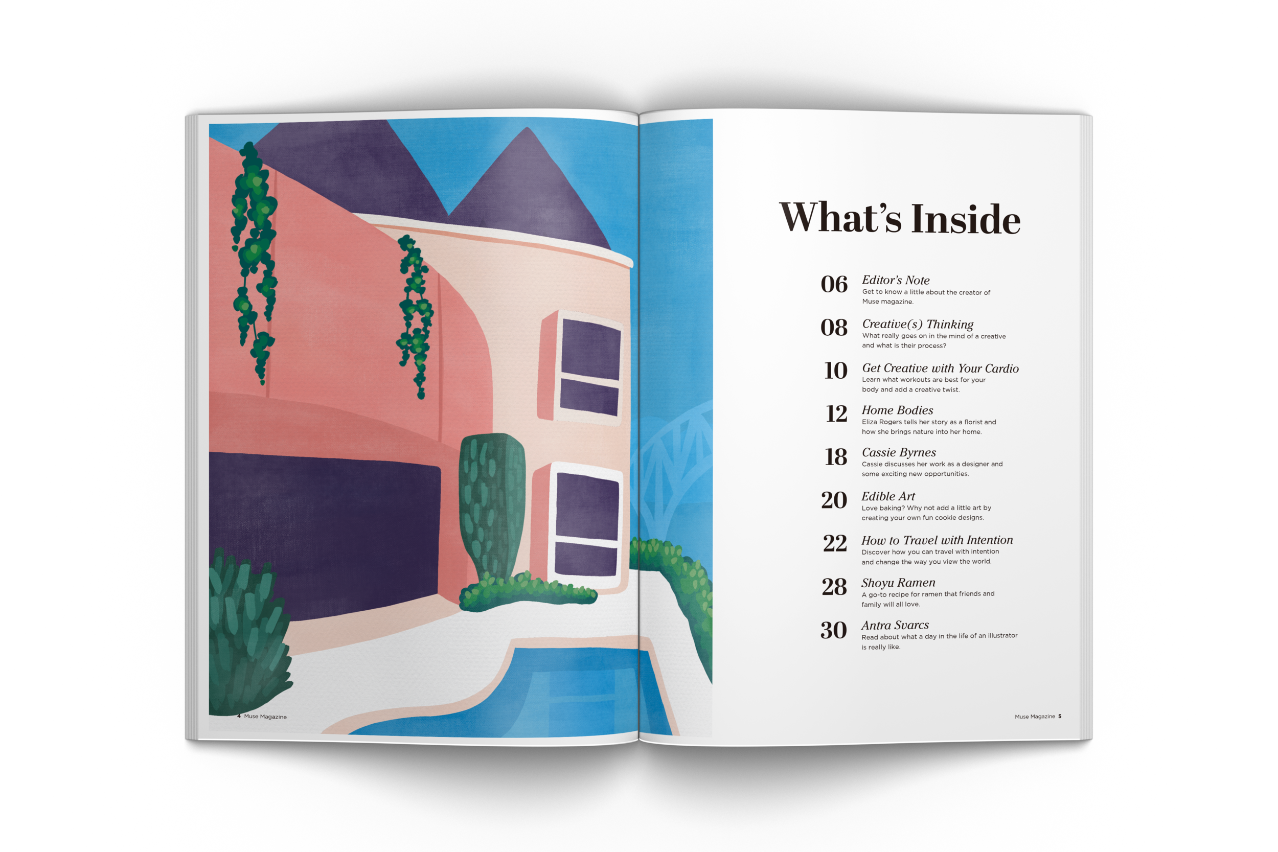
OVERVIEW
Muse magazine is a publication that explores what it is like to live a creative lifestyle. My goal was to inspire and empower the younger generations of women to express their own individuality and put their personal touches on the world. I wanted to stand out amongst competitors with the perfect balance of topics such as food, fashion, travel, art, interior design, etc. which are shown through exciting illustrations and inspiring photography.
SOLUTION
In order to appeal to this generation's creative individuals, I have created an identity system with vibrant colors, expressive type and fun graphics in order to create an approachable and inspiring tone.
BRAINSTORM
In the world of publications, there was a need for a magazine that solely encouraged how to live out a creative lifestyle. Whether that be in cooking, interior design, travel or clothing, the goal was to show readers how they could add creativity to any aspect of their life. I began to word list and mind map publication names and article topics.


LOGO SKETCHES
When creating a concept for the brand logo, I wanted to appeal to a younger audience and focus on the "u" in Muse to allude to a reader's own lifestyle. This hints towards the fact that is it your creative lifestyle. Along with this, I chose a playful, hand drawn type to bring a friendly tone to the brand.

LOGO
After receiving some feedback, I decided to go with a groovier type to create a more dramatic emphasis on the character u. My goal was to create a logo that was cohesive with the illustrative style of the publication.

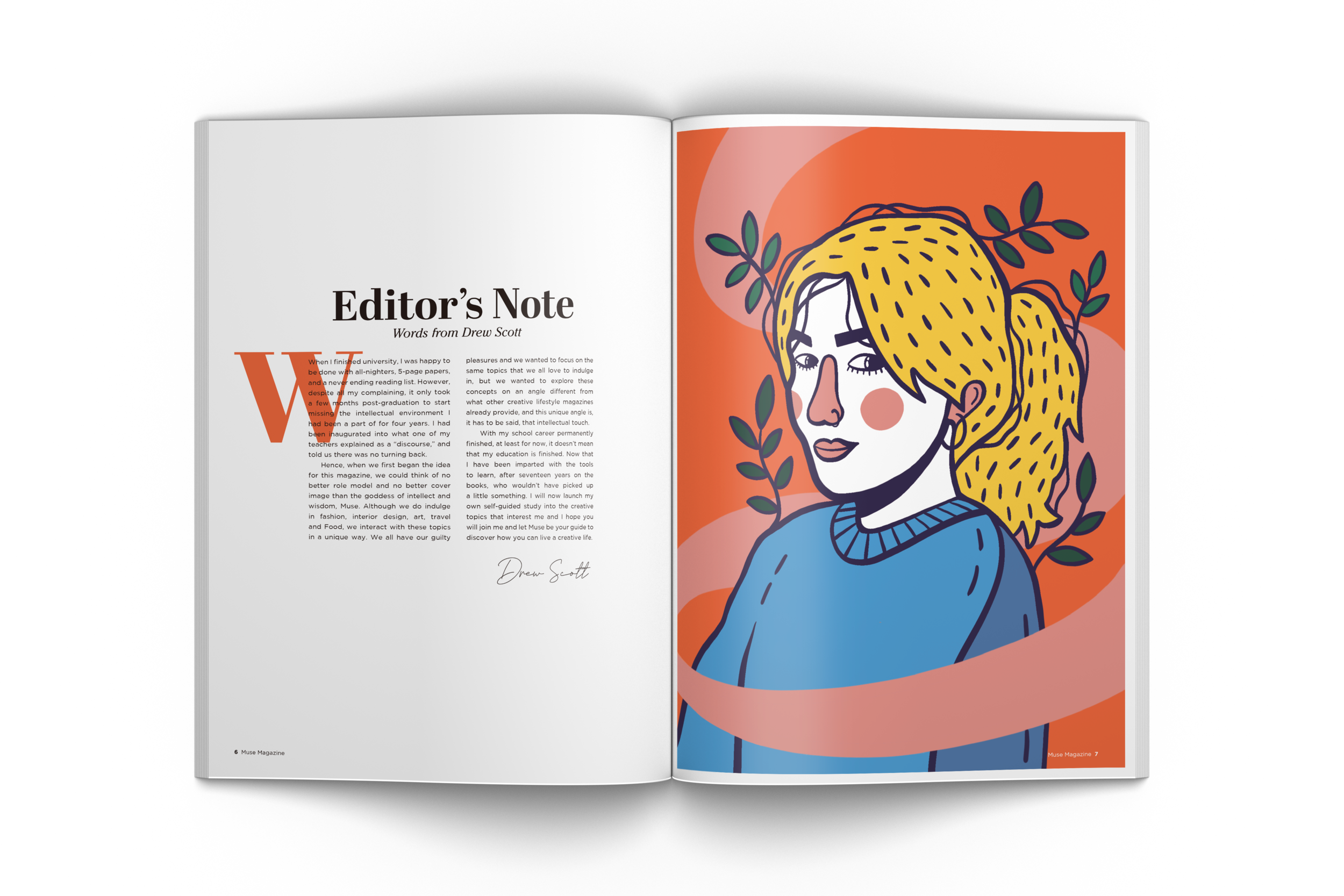
IMAGERY
For this rebrand, I utilized bold, engaging illustrations, approachable photography, vibrant colors, and expressive typography to convey a friendly, inspirational, do-it yourself tone to our audience.
COLOR
As far as color palette, I chose to introduce vibrant, bold colors to compliment the use of illustrations throughout the publication.
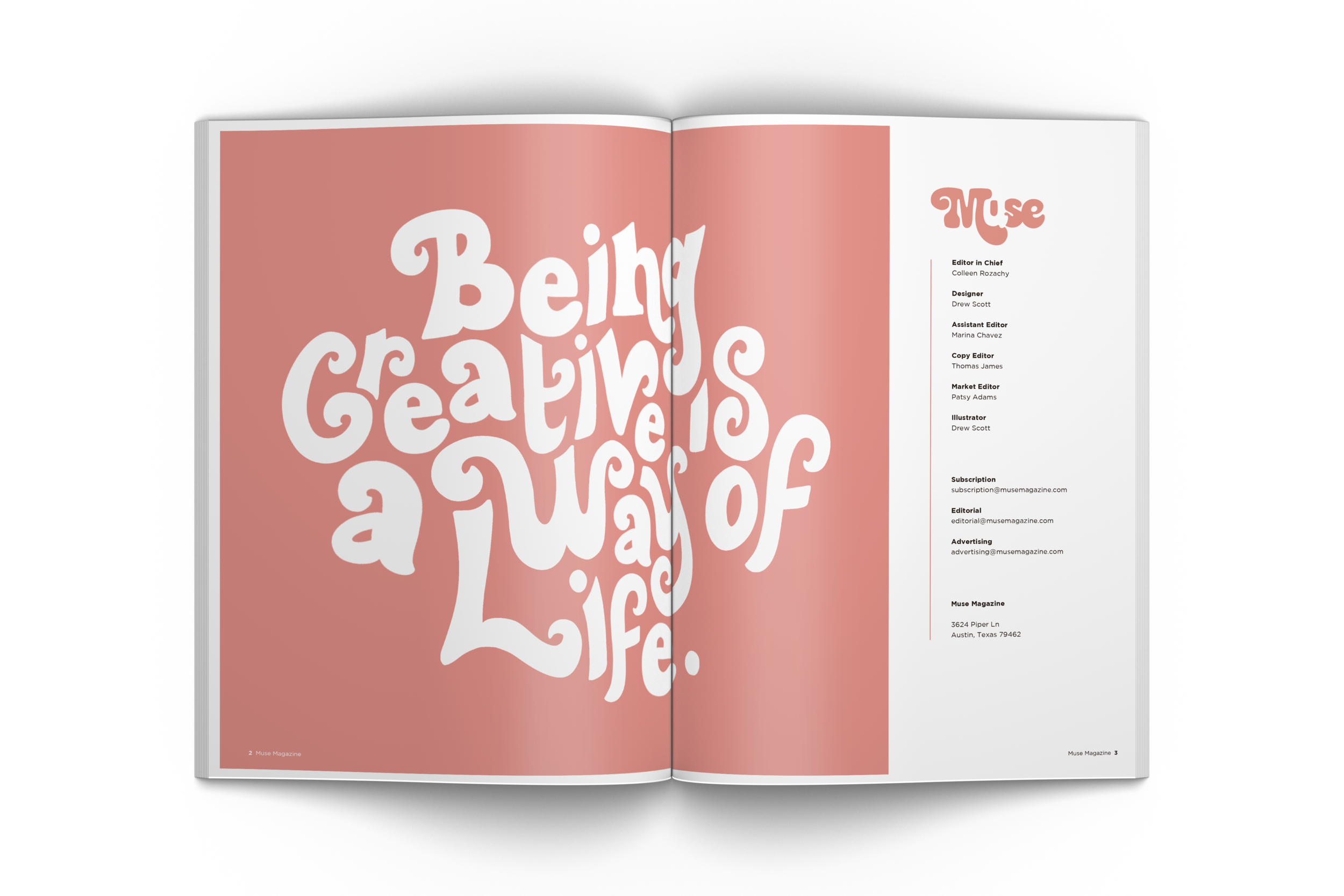
TYPOGRAPHY
The typography utilized in this rebrand considers its competitors and draws inspiration from funky, fun, and expressive hand drawn typography.

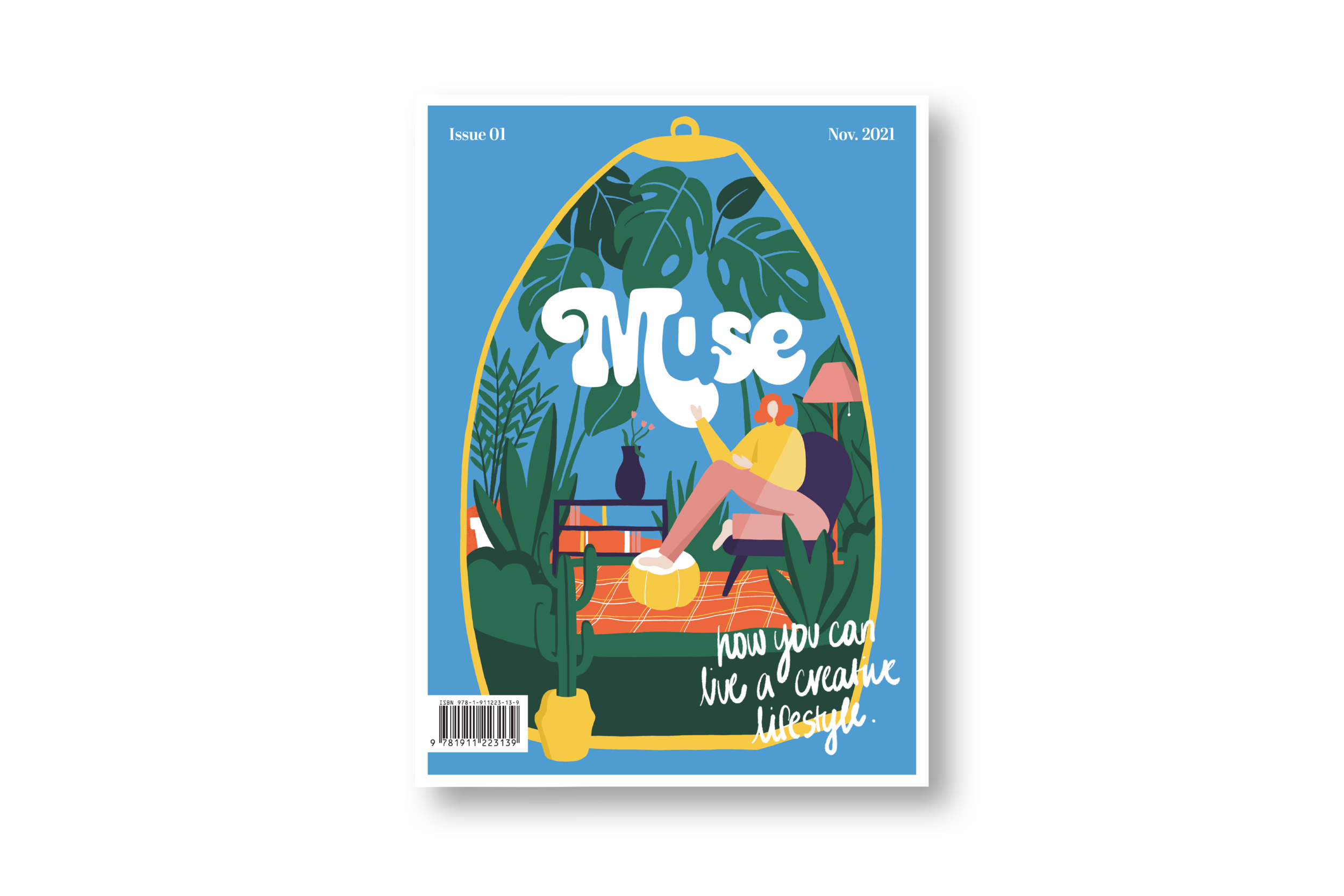
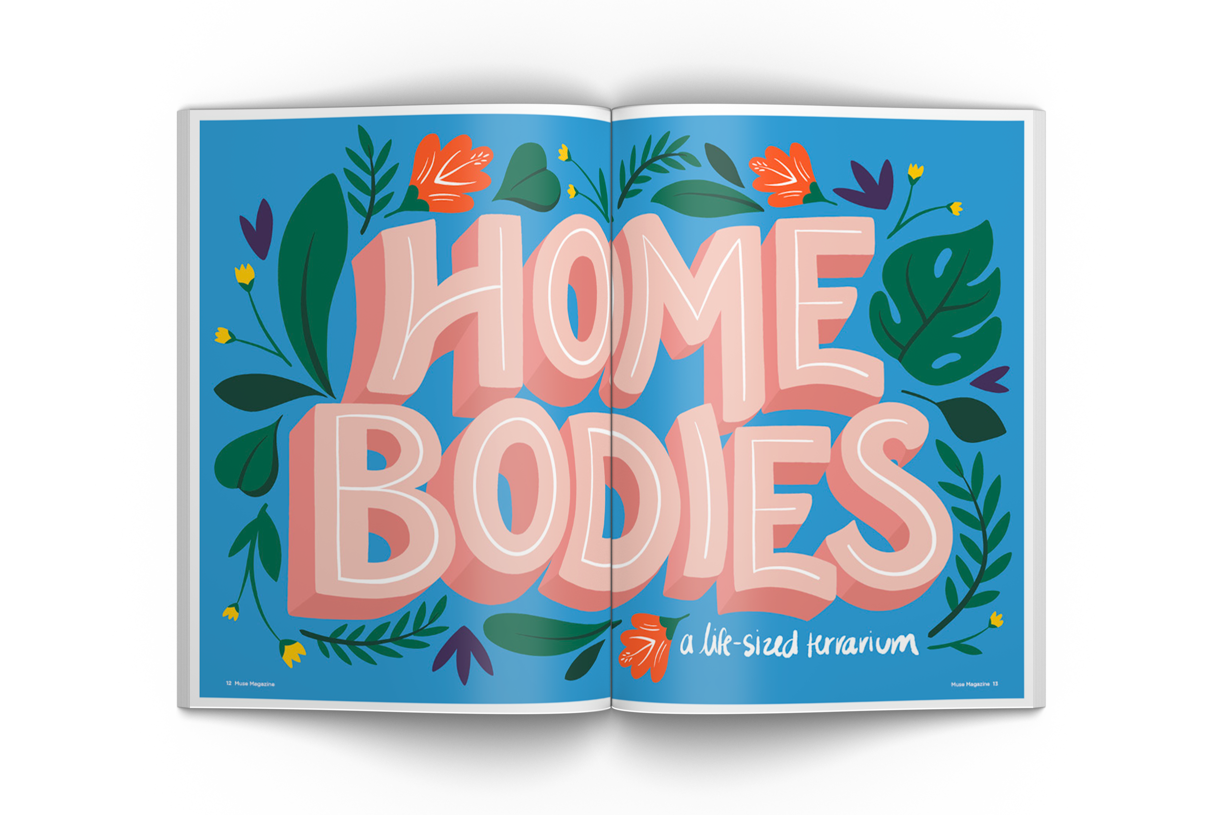
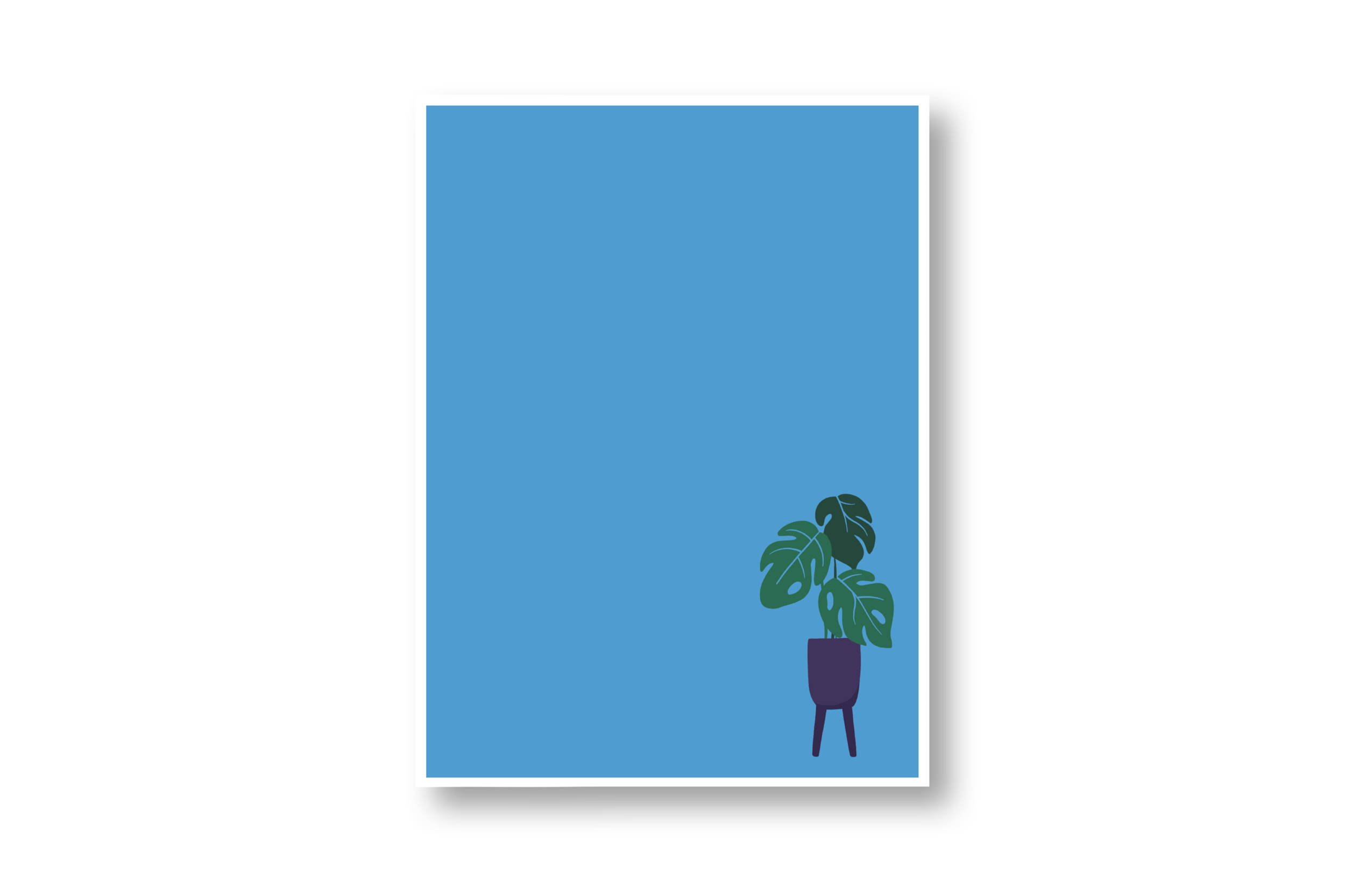
COVER PROCESS
When designing the cover, I focused on my featured story that discussed interior design and the use of plants as decorative elements. The concept was to visually represent an indoor space amongst a variety of plants. A terrarium was the perfect containing structure for my design, as it shows an eye catching and playful illustration. It provides insight to the overall tone of the publication and sets it apart from its competitors.


REFLECTION
Overall, this newly designed publication successfully stands out among its competitors and allows for readers to discover something new. It's use of illustration, hand-drawn type and imagery helps to catch the eye of readers and accurately portrays the brand's message. Muse Magazine encourages readers to incorporate creativity in every aspect of life and hopes to inspire them to put their own creative touches on the world.