

ARTISTRY: CASE STUDY
Packaging Design
BRANDING | ILLUSTRATION | PACKAGING
OVERVIEW
Most art subscription boxes on the market today are pricey and do not allow creators to sample products before purchasing them. As a result, I wanted to focus on creating a cohesive art subscription box series that offers art supply samples at an affordable cost. My solution was Artistry, an affordable art subscription box that sends monthly art supplies straight to your door.
SOLUTION
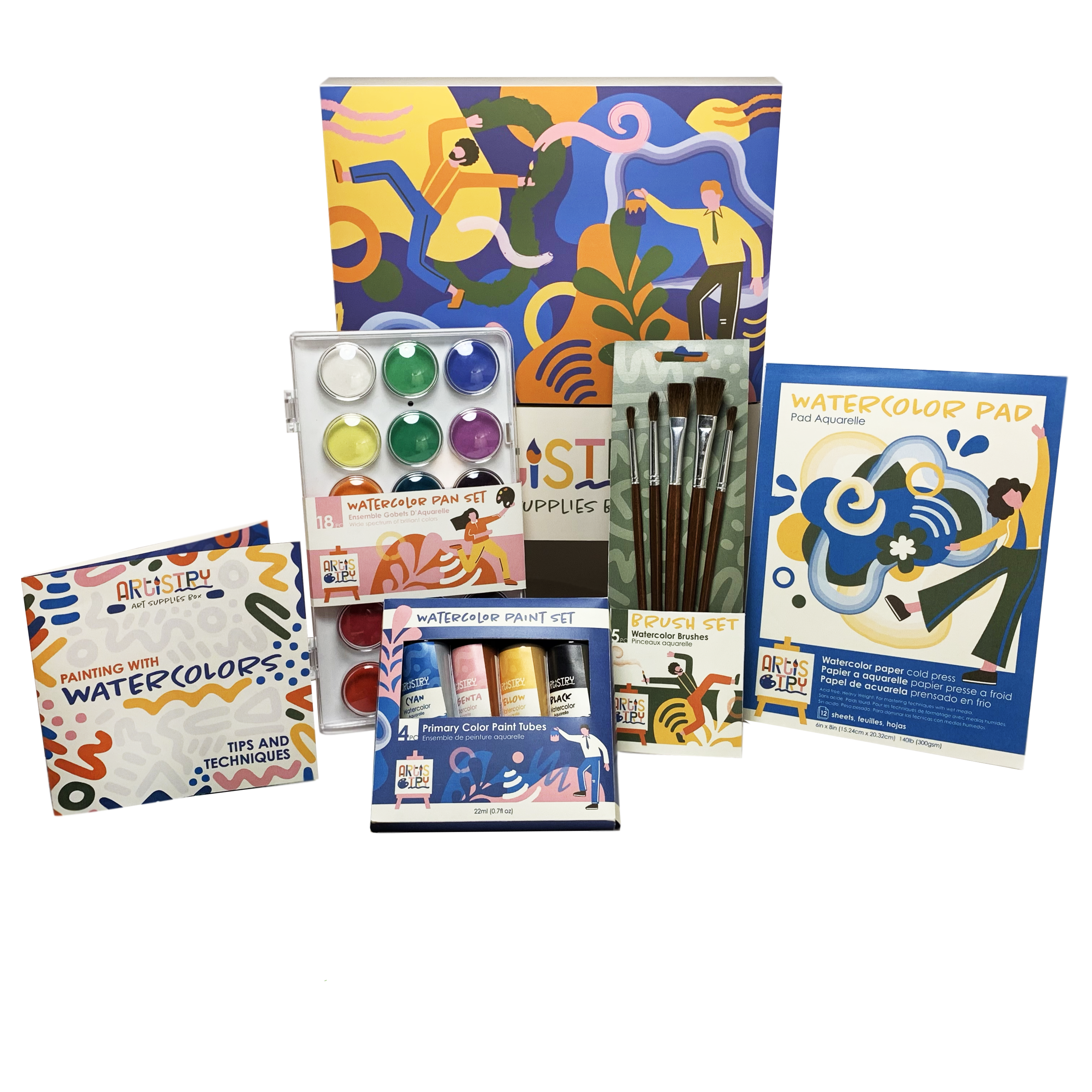
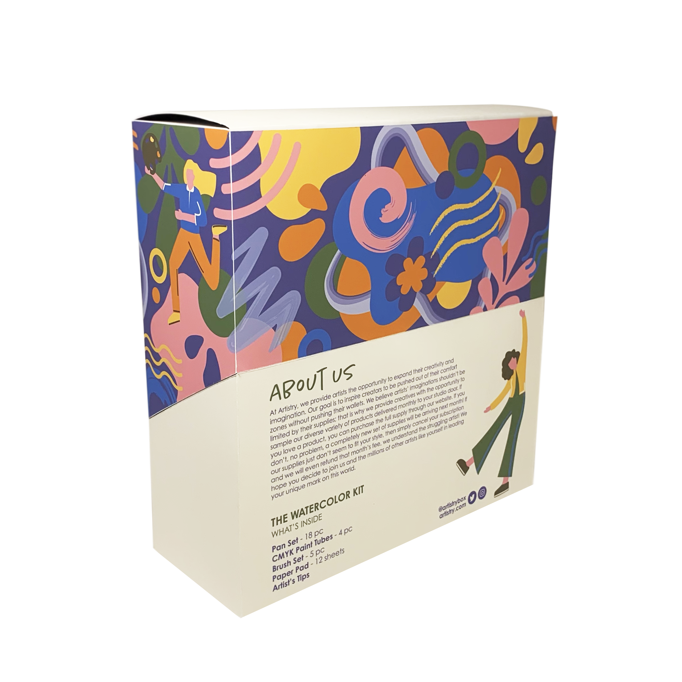
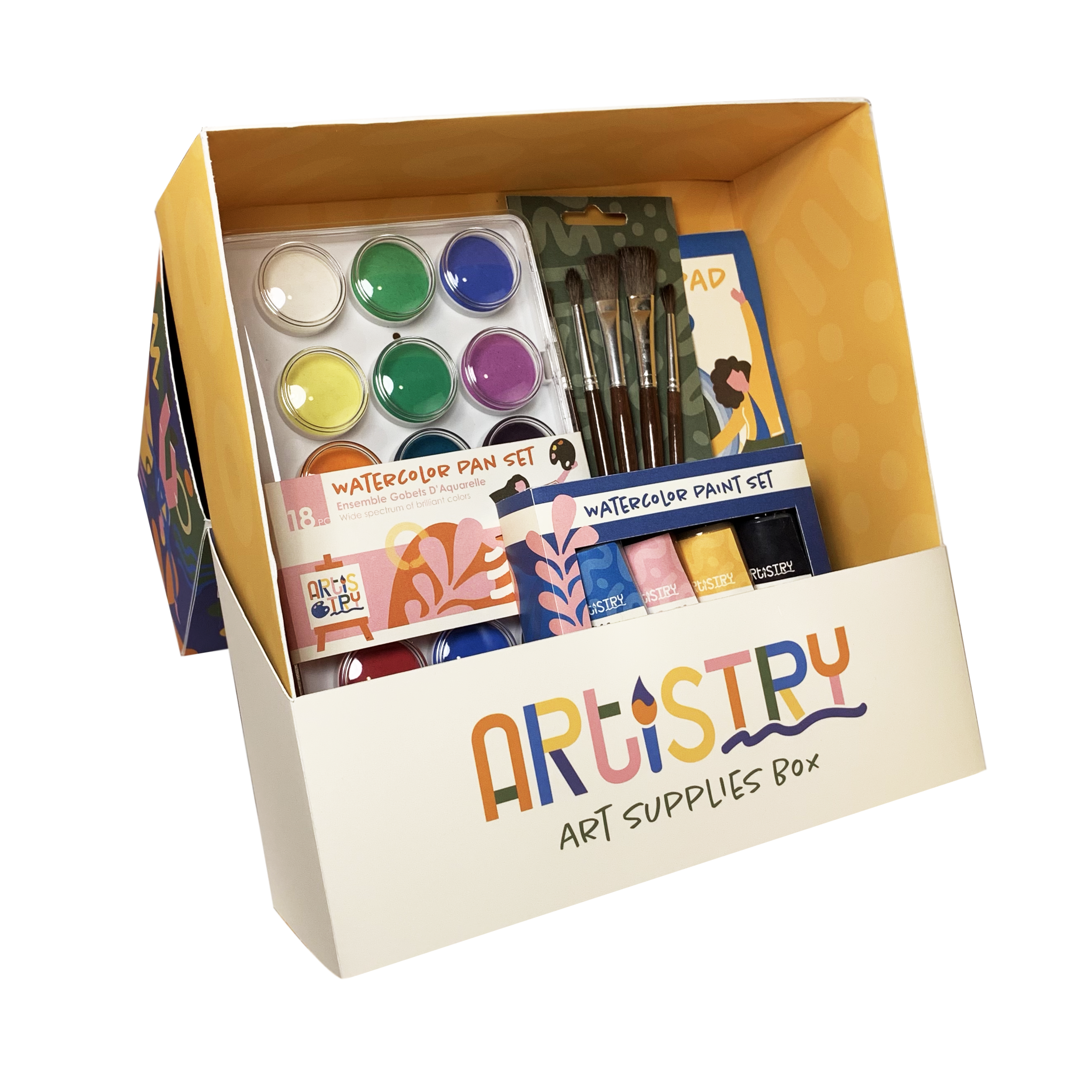
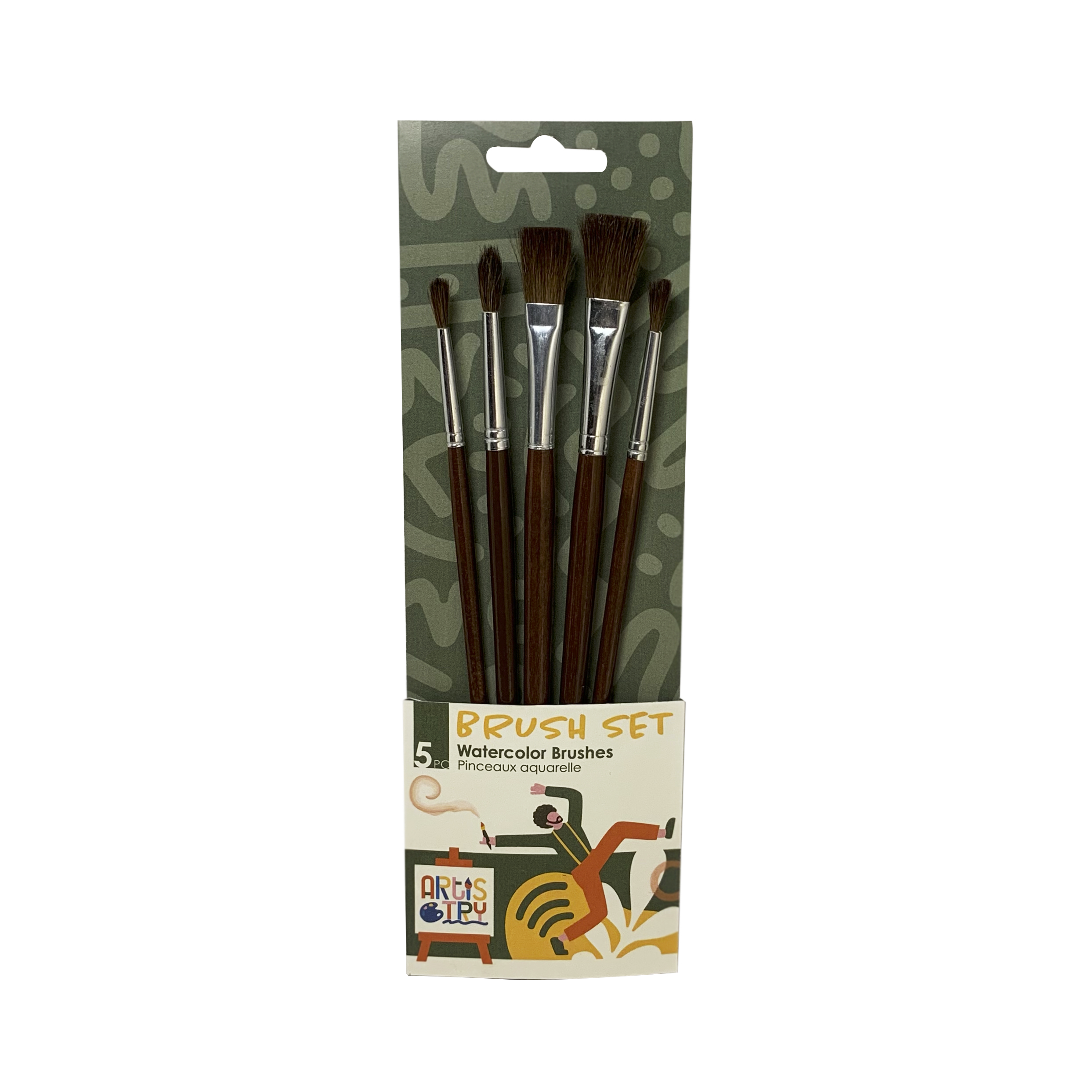
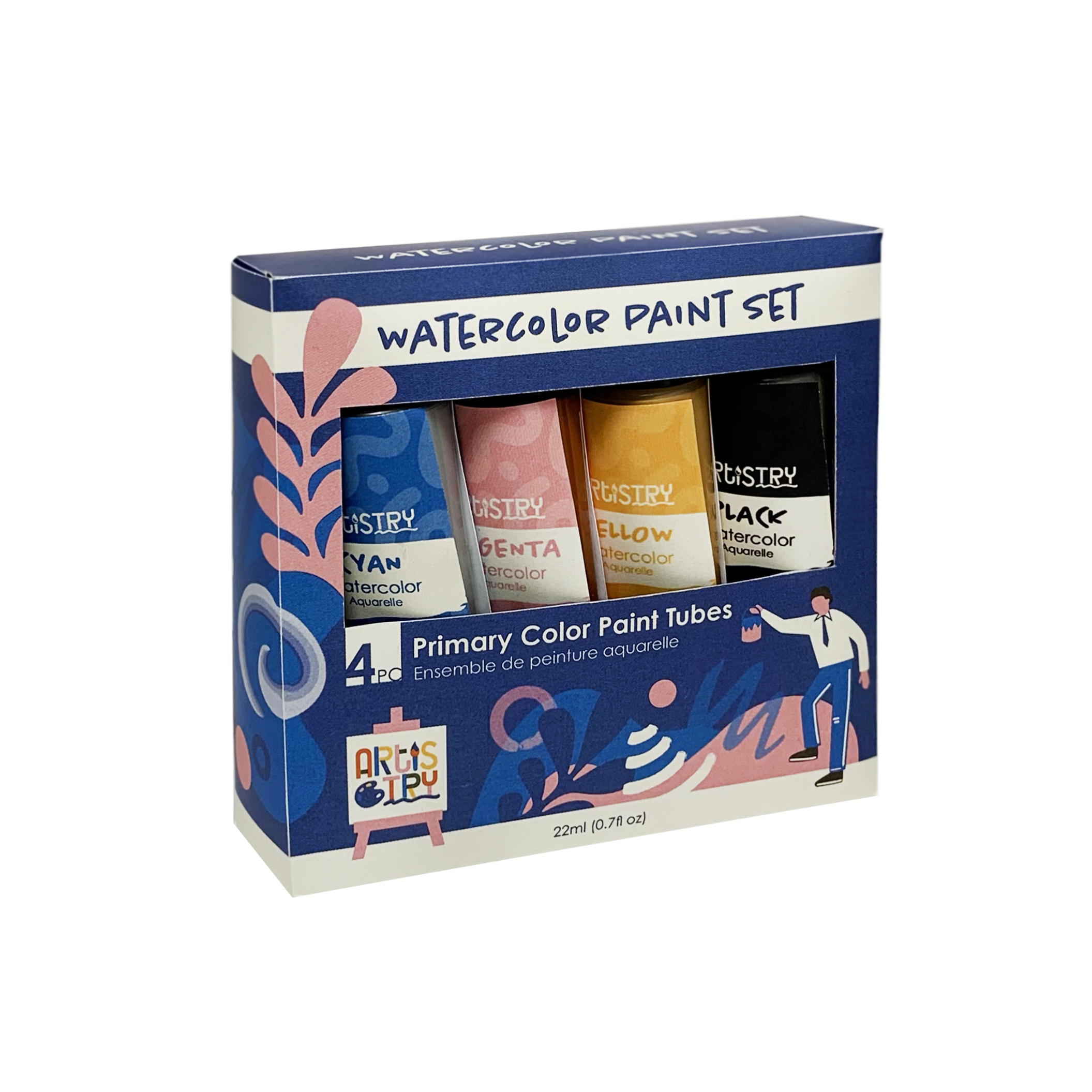
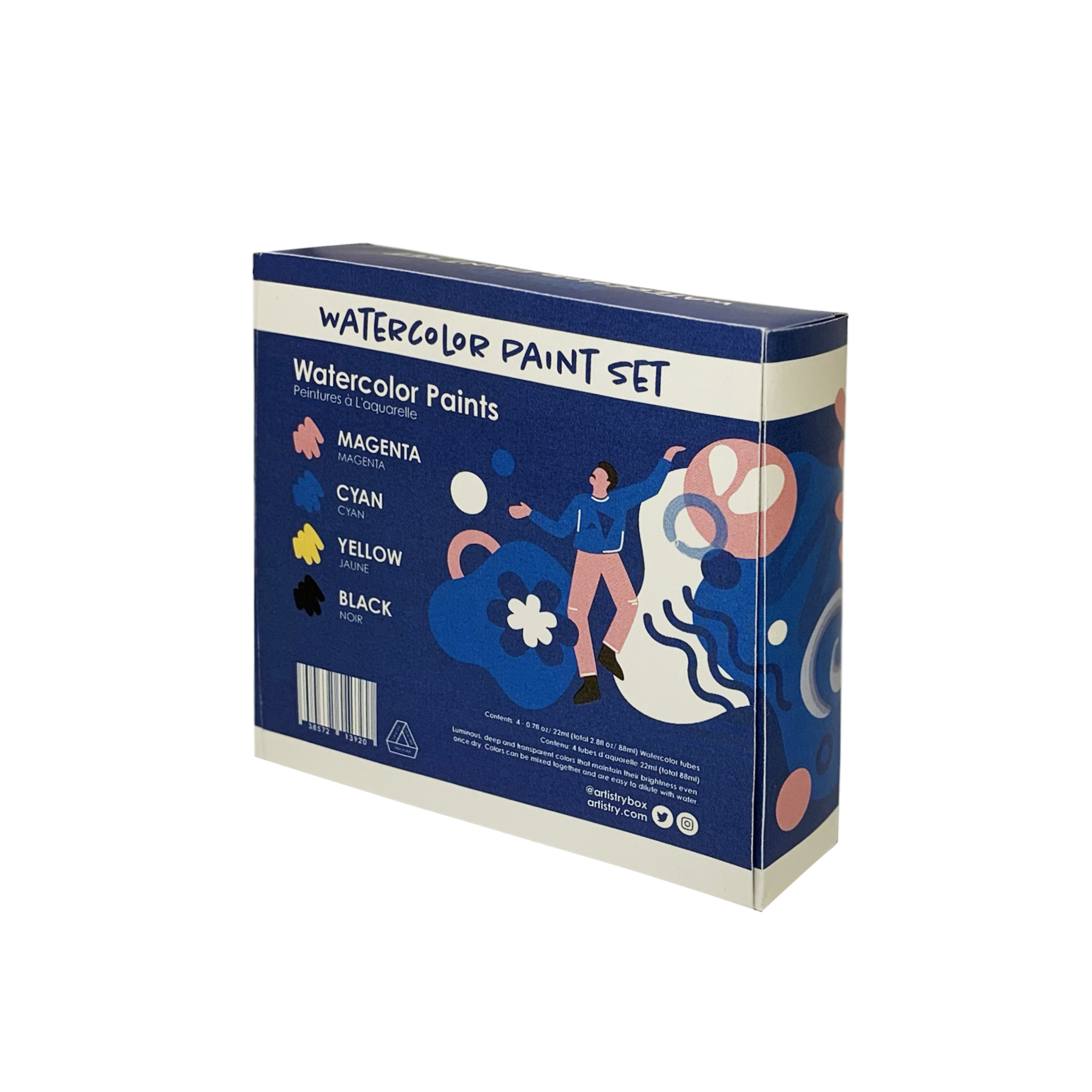
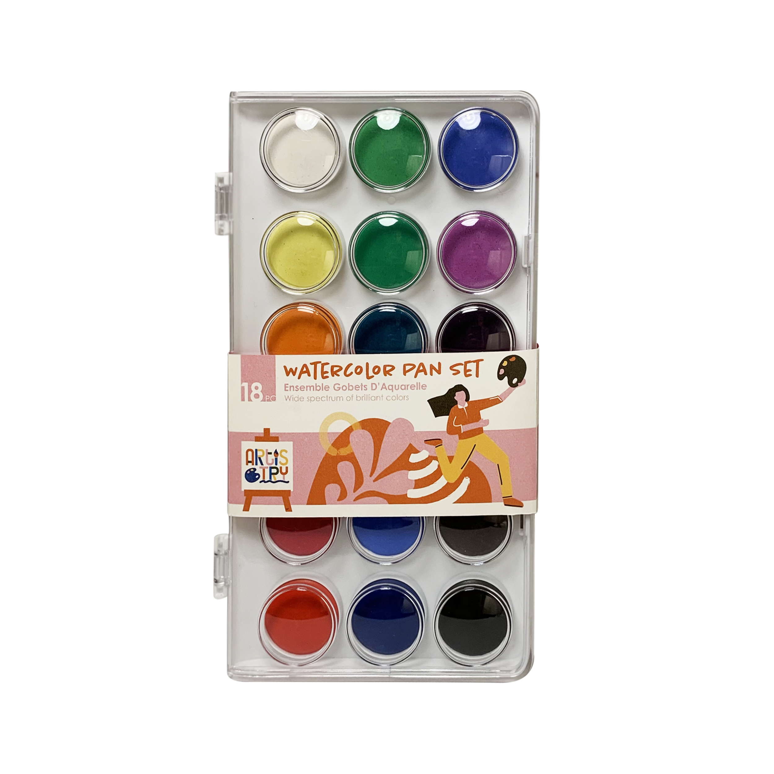
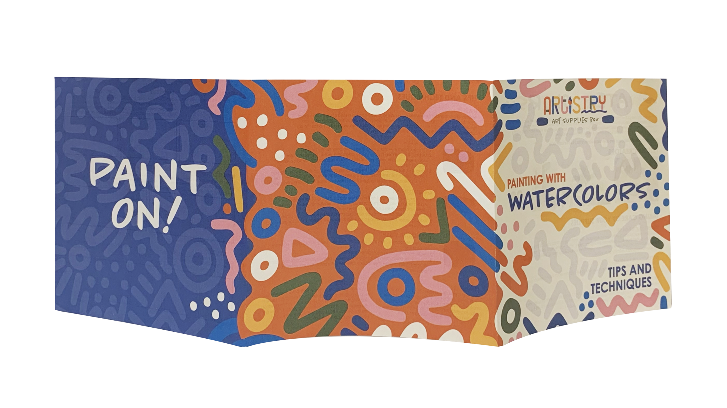
For this packaging series, I have created seven separate packaging pieces under the same brand. This series consists of a containing structure, five different product labels and a three panel tips and techniques booklet. Each piece is uniquely executed for every product.
LOGO SKETCHES
When brainstorming what I wanted to communicate through the name and visuals of the logo, artistry, create and try came to mind. I decided on the name Artistry as it plays off this relationship where the word try can be found in artistry. As for the logo itself, I wanted it to be playful and really embody creativity. I found myself going back to this idea of color blocking the characters and decided to play off this concept.


LOGO
By focusing on color blocking each character, I was able to bring in a wide range of colors similar to a paint palette. I also made the decision to utilize the character I and mold it into a paint brush. I then put emphasis on the “try” in artistry but underlining it with a brush stroke. This then connects the paint brush and helps it feel more intentional.
IMAGERY
When developing the brand look, I wanted to invoke creativity. The illustrations help to communicate a playful tone and the endless possibilities of this product. I also chose a variety of vibrant colors to not only engage consumers but relate back to a paint palette.
COLOR
Lastly, I wanted to stray away from typically art supply brands that do not utilize vibrant colors and chose to do just that. I chose a variety of bright, vibrant hues as I felt it was appropriate for an art supply brand and communicates creativity.
TYPOGRAPHY
The subhead typography compliments the hand-drawn feel of the visuals and pairs well with the blocky logo. The subhead and body copy are simple and clean to not conflict with the illustration. It provides geometric structure in the midst of all the fun, organic shapes, but still feels approachable and on brand.


REFLECTION
Overall, this newly designed packaging series grabs the audience’s attentions and stands out amongst its competitors on the shelf. The use of vibrant colors and playful visuals helps in creating an artsy and inspiring tone. Artistry offers creative individuals the freedom to try a wide variety of art supplies at an affordable cost and in the comfort of their own studio. Creatives can now not only explore different mediums with ease, but also expand their skills and techniques.


